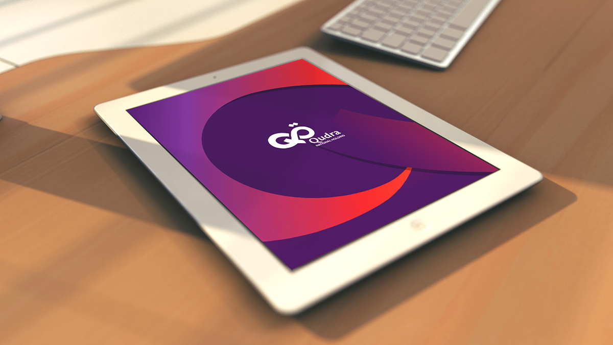
The thought behind this concept was to show Qudra as progressive and diverse. Combining Qudra’s initials in english and in arabic
in a strong bond is essential to represent the international scope behind this holding. Therefore we combined both sides in an infinity
sign which is a symbol of amazing potential and solidness. In this new shape, the West and East are brought together as one
entity representing the diversity and unity of Qudra at the same time.
We introduced fresh colors representing new young blood (generation) while also making it very sophisticated. The red/orange colors
are fiery colors that show an aggressive lively side whilea hint of purple to highlight on the wisdom and royal aspect of the holding.